SHELTER has a new corporate visual identity
The strategy starts from a new site, whose graphic design is dedicated to the environment that surrounds us, from the renewal of the entire visual identity and from the communication of our fundamental values.
After a graphic restyling, our logo now has a more modern design, always respecting its original version to which we are very linked. Next to a new font and a new payoff, the coloured pinwheel remained, representing the different services offered, the dynamism of the wind and of the company itself.
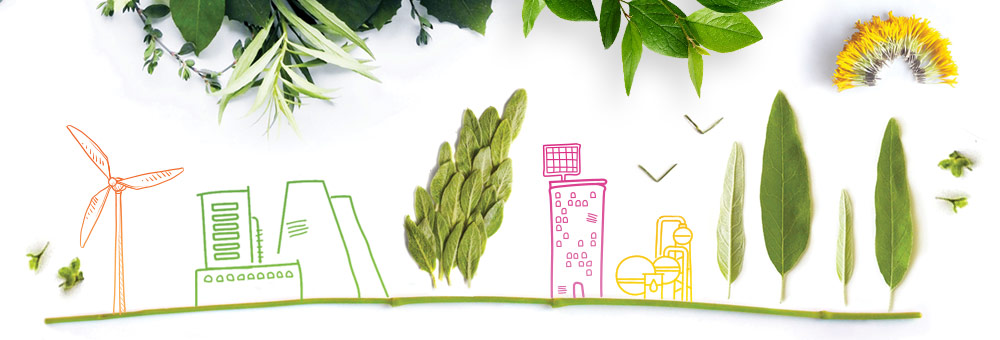
The graphic theme of the site is a continuous reference to the environment, to the sustainability of doing business made possible by the company's activity, which works to reconcile business and the environment.
The communication strategy also includes a social channel. SHELTER's LinkedIn page will bring together all members of our team, with institutional and sector content.

